This month we look at another building load calculation feature: load maps. Load maps are a way for you to visualize your HVAC building load calculations. As one customer of ours put it, “It is a great way to quickly check load figures or send a client the loads without all the details.” Unlike other features in our load calculations, this feature is one that our software has that others do not.
When you insert a load map on the drawing, each room is shaded with a value related to the load calculation. Rooms with low values are shaded dark. Rooms with high values are shaded light.
When checking load calculations, comparing shades of color using the map is much easier than looking over a list of numbers. For example, look at the cooling load detail below. How long does it take to find the error?

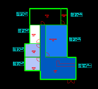
Now look at the load map showing the glass load in each room. Black corresponds to 0 load, white is the highest load, and blue is in the middle. How long does it take to find the error?

The glass load in the two rooms at the top of the building are 0. In the print out, it is hard to pick out the 0 glass load in the sea of all the numbers. When viewing the load map, the two black rooms jump out at you. Seeing this, the designer can check the inputs for those two rooms and fix them if necessary.
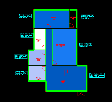
The larger room is an office and should have glass. The smaller room is a storage room which does not have glass. After adding glass to the office and confirming that the storage glass is correct, the load map can be updated. The office now has a glass load, like you would expect.

Try running some load maps on your next project. If you have ideas about additional maps you would like us to add, make a suggestion on our wish list.
